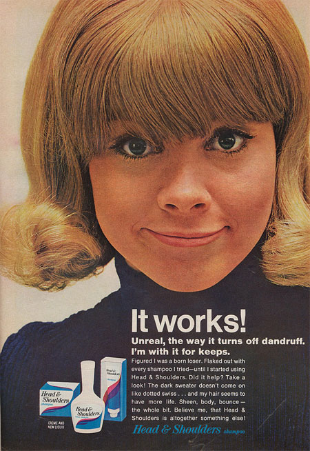
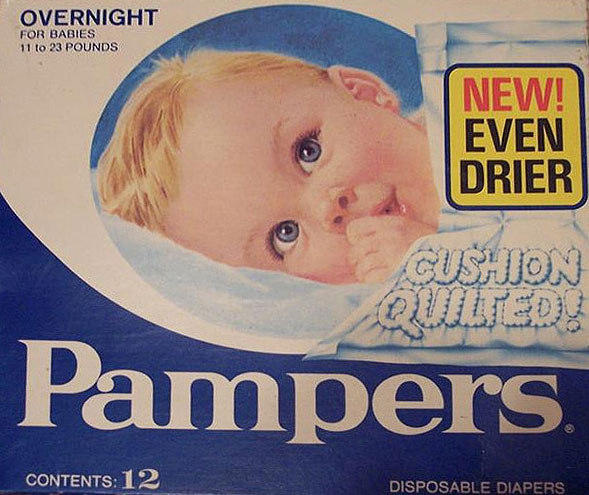
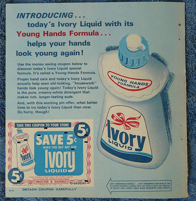
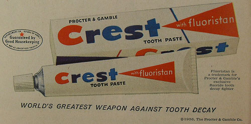
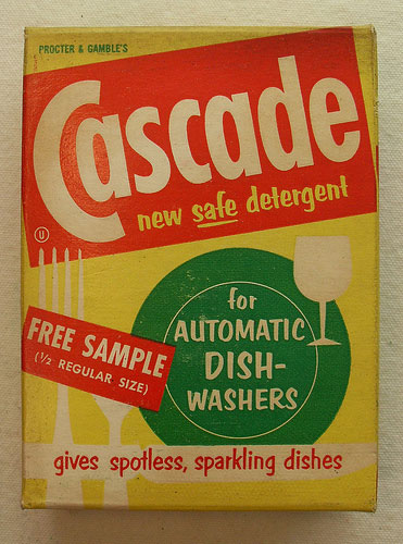
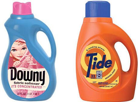
It isn’t unheard of for long-standing brands to tap their image banks for bygone design treatments. Proctor & Gamble is currently doing just this, having made available a set of limited-edition packages for Downy, Bounce, and Tide. (They are available at Target until June 10th.) Brilliance? No. Worth taking note of? Perhaps.
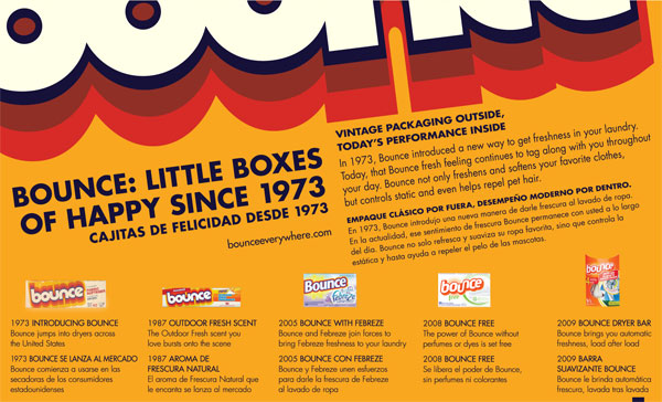
Sure, it could all be construed as a ploy to leverage the outrageous cultural impact of
Mad Men (à la
Banana Republic). I’m more inclined to argue that the visceral response we have to these utilitarian soap packages has everything to do with the amount garish, inappropriate packaging found in so many consumer brands today. Much of it is slick, but very little feels human.
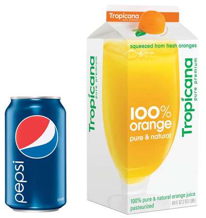
Could it be that what makes us take notice of efforts like this, is found the relative personality of the packaging artwork? Could it be that we secretly crave such approaches? Maybe this is something we need: something decidedly “Un-Arnell”—just think of where he pushed the packaging for
Tropicana and
Pepsi packaging.
The real pity here is that P&G dropped the ball before it really got interesting. What would have happened if they had brought it all back?
Like...


 Sure, it could all be construed as a ploy to leverage the outrageous cultural impact of Mad Men (à la Banana Republic). I’m more inclined to argue that the visceral response we have to these utilitarian soap packages has everything to do with the amount garish, inappropriate packaging found in so many consumer brands today. Much of it is slick, but very little feels human.
 Could it be that what makes us take notice of efforts like this, is found the relative personality of the packaging artwork? Could it be that we secretly crave such approaches? Maybe this is something we need: something decidedly “Un-Arnell”—just think of where he pushed the packaging for Tropicana and Pepsi packaging.
 The real pity here is that P&G dropped the ball before it really got interesting. What would have happened if they had brought it all back? Like...
