I admit this is a little aside from the campaign-focused mandate of undrln. It is, however, a big idea that’s worth mentioning.
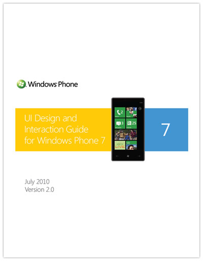
I’m a big fan of the Metro design system. It signifies what good interface design should be: clean, efficient, and free of any unnecessary noise. While many are convinced that everything needs bevels, depth, and gloss, I want hardcore simplicity. A quick review of the
UI design and Interaction Guide for Windows Phone 7 illustrates just this sort of sensibility.
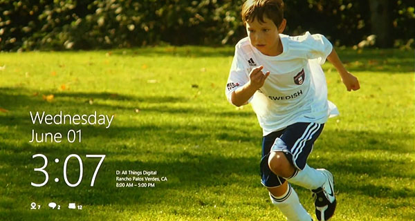
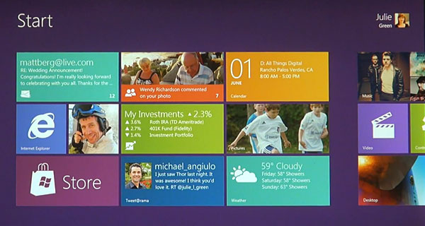
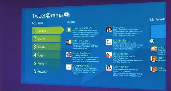
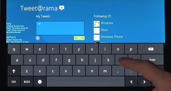
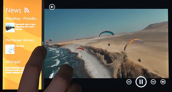
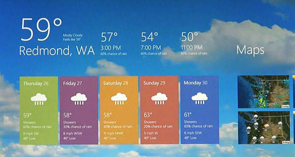
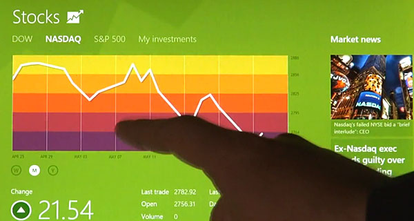
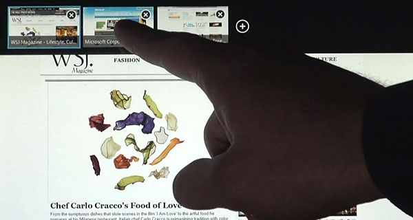
This week, the team at Microsoft released a small glimpse into how Windows 8, which comes with a strong Metro flavor. Yes, this is largely centered around the tablet experience. Yes, there are questions about how it will work with a mouse versus in a touch environment. And yes, the fanbois will hate it.
http://www.youtube.com/watch?v=p92QfWOw88I
Little of that matters. Redmond is truly innovating here, and even better yet, Jensen (who narrates the video) seems like a real guy. None of the pretense we find in Apple’s promotional videos; just a guy who seems genuinely excited by what his group is working on.
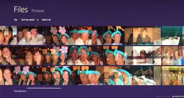
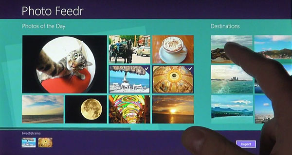
Some screen caps:


 This week, the team at Microsoft released a small glimpse into how Windows 8, which comes with a strong Metro flavor. Yes, this is largely centered around the tablet experience. Yes, there are questions about how it will work with a mouse versus in a touch environment. And yes, the fanbois will hate it.
http://www.youtube.com/watch?v=p92QfWOw88I
Little of that matters. Redmond is truly innovating here, and even better yet, Jensen (who narrates the video) seems like a real guy. None of the pretense we find in Apple’s promotional videos; just a guy who seems genuinely excited by what his group is working on.
Some screen caps:
